An Atomic Design System
The transformation of HCF
At HCF we were tasked to work on a major transformation, as a part of this project an integral piece was establishing a new design system from scratch.
My Role: UX, UI
Project Type: Design System
Tools: Figma, Miro, Jira, Confluence, More+
Discover
The WHY - Insights into the Problem Space
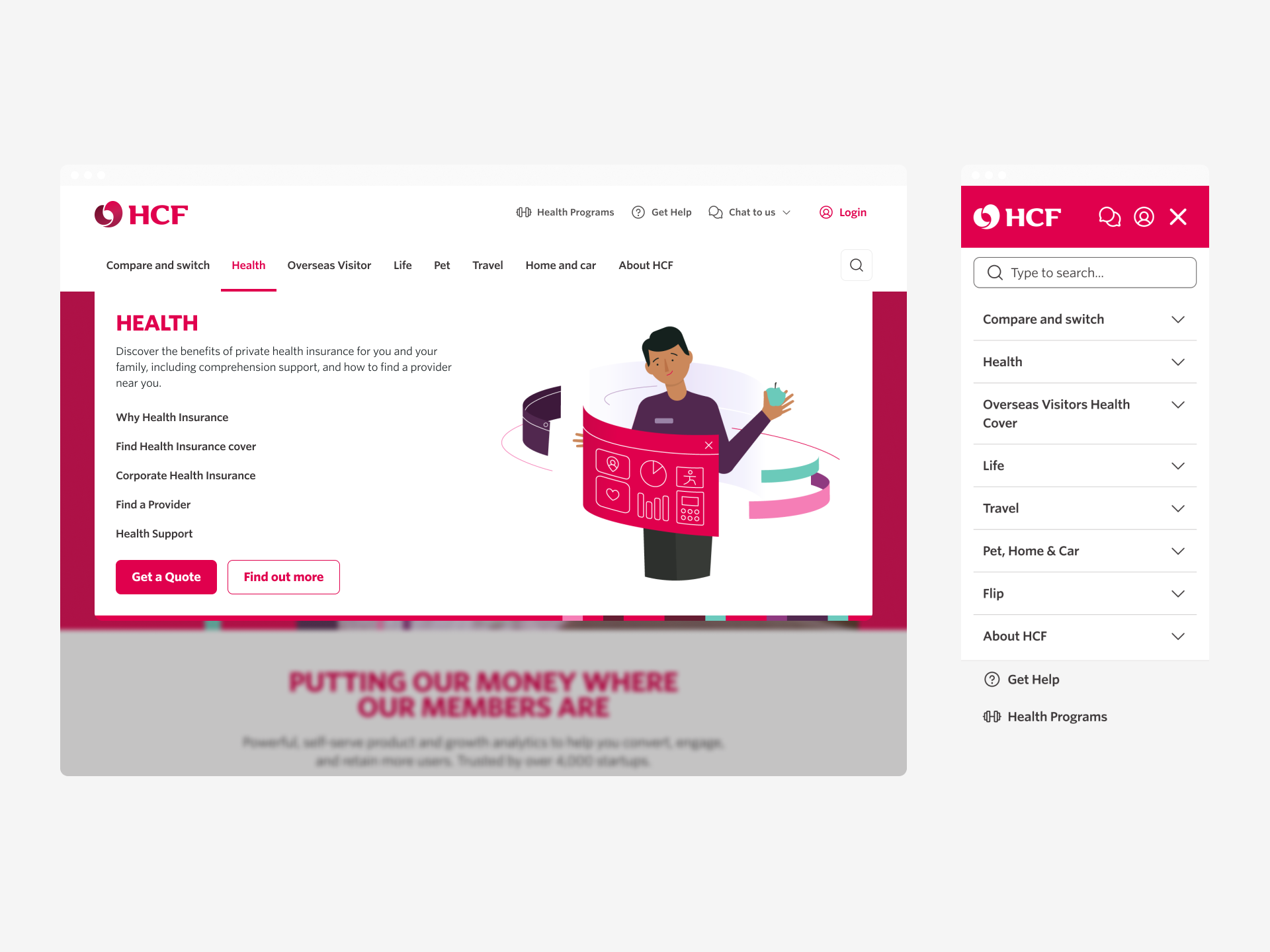
HCF’s website was outdated, resembling a relic of the .com era. The design was overly reliant on its brand’s red and grey colors, creating a blocky, content-heavy interface that failed to meet accessibility standards.
Competitor analysis revealed that brands like NIB, BUPA, and AHM had embraced modern, minimalistic designs that not only reinforced their brand identities but also delivered superior user experiences.
HCF needed to modernize its digital presence with a scalable, accessible, and future-proof design system that would elevate its website and align it with the experience offered by its updated app.
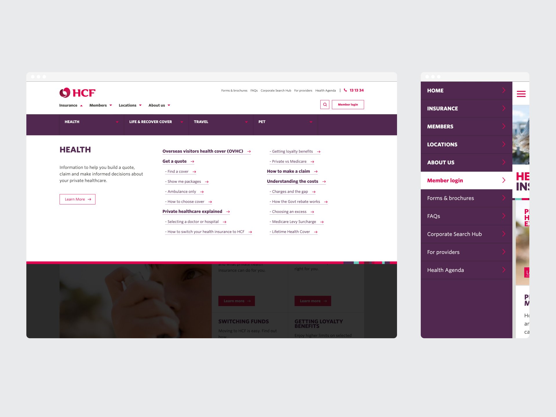
Original HCF menu and header
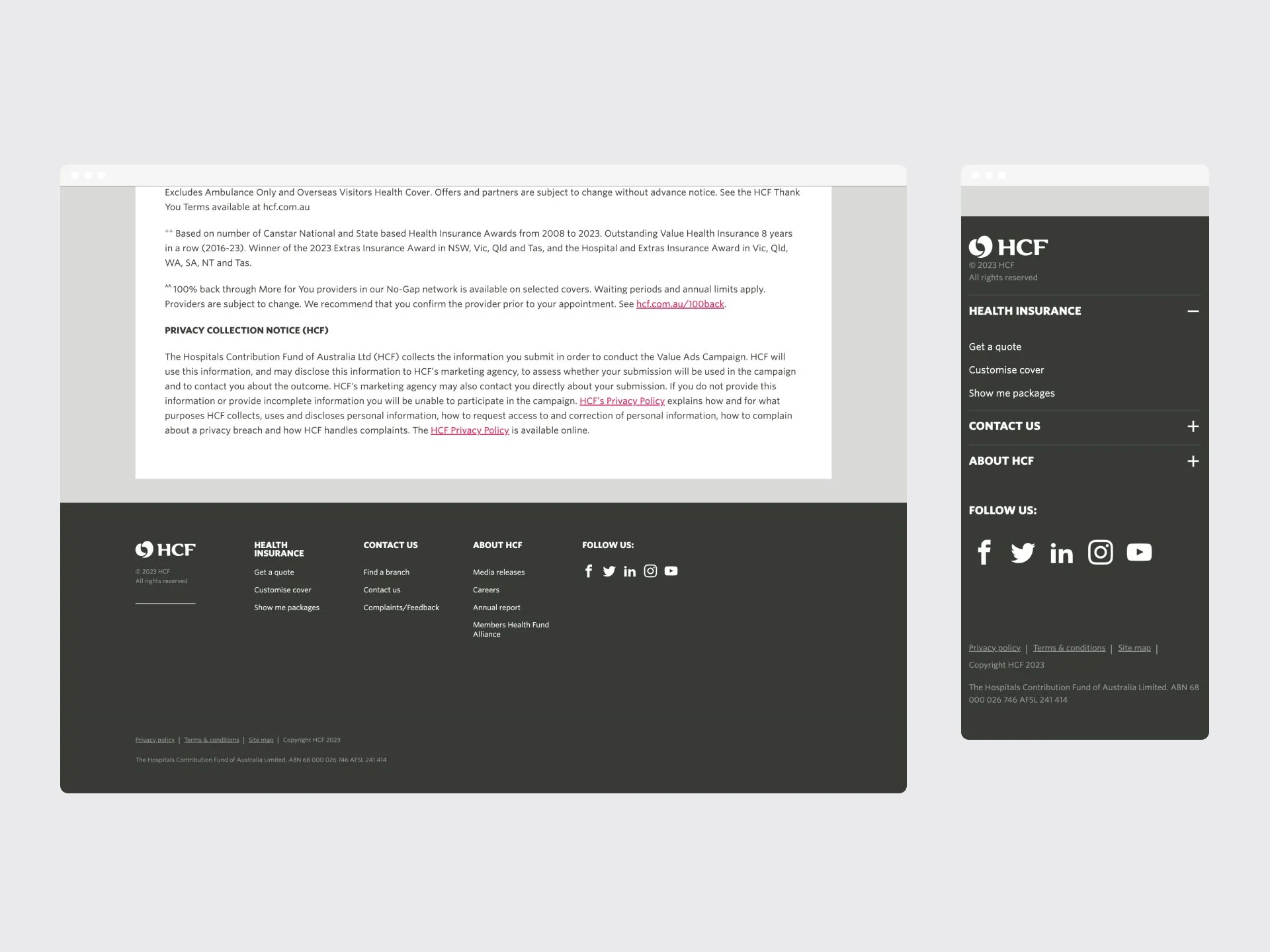
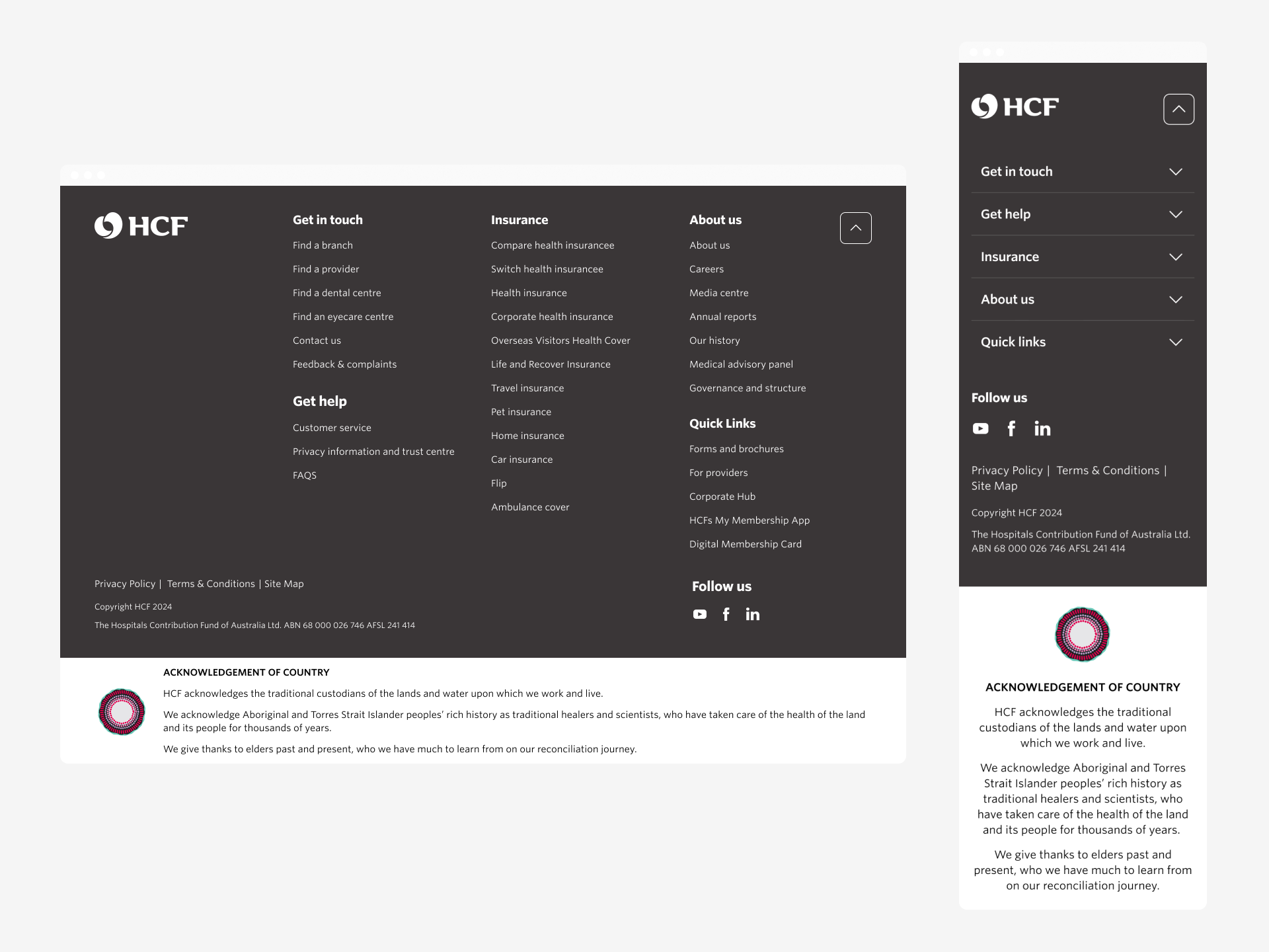
Original HCF footer
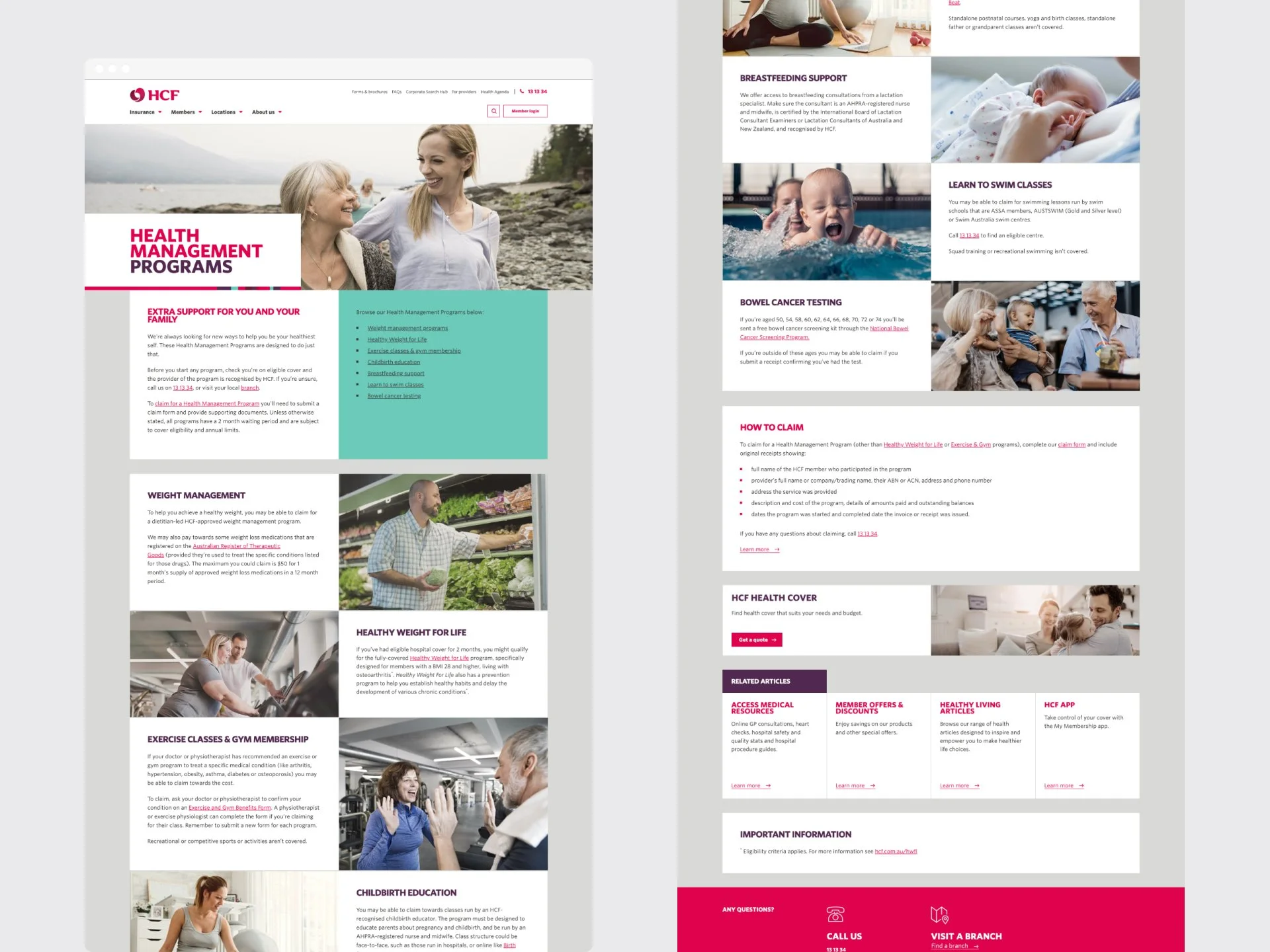
Original HCF home page
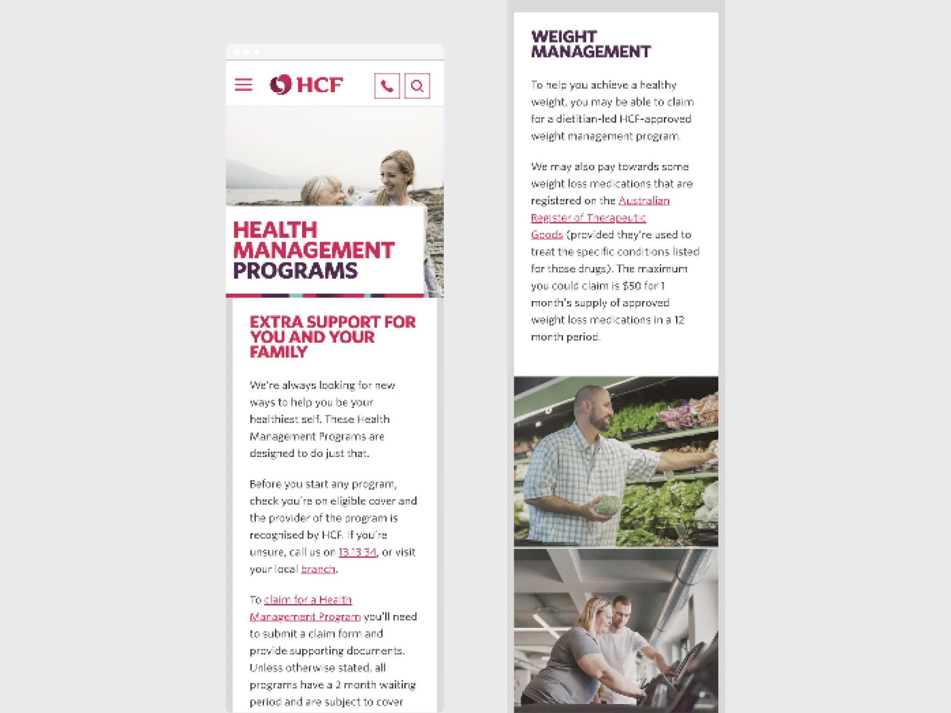
Original HCF home page mobile
Define
The WHY & HOW - The Project Goals
Our goal was to create HCF’s next-generation design system: modular, scalable, and built to last. Grounded in Atomic Design principles, we set out to deliver a consistent and accessible foundation that would unify the user experience across all digital platforms. Every component needed to meet WCAG AA standards—ensuring inclusivity was never an afterthought.
And we had to do it all under an exceptionally tight deadline.
-
Simplify HCF digital assets for a modern, minimalistic, and user-focused interface, reducing clutter to highlight key content.
-
Prioritising accessibility, bringing in a greater awareness and inclusion of accessible design, ensuring the system meets a minimum of WCAG AA standards.
-
Ensuring we stayed true the the HCF brand, whilst uplifting them into the future - through refining whilst retaining core aspects such as colour, illustrations, and essence.
-
Clear documentation and extensible patterns, alongside modular and scalable componentry - this design system is built for the future.
-
Create an intuitive, simple to use, and friendly experience for users - through ensuring we uplift their experience without reworking the wheel
Develop
The HOW - Processes and Methods
In this phase, we transformed strategy into tangible design. We redefined the visual language through softer UI elements, purposeful colour use, and improved spacing—enhancing both brand expression and usability.
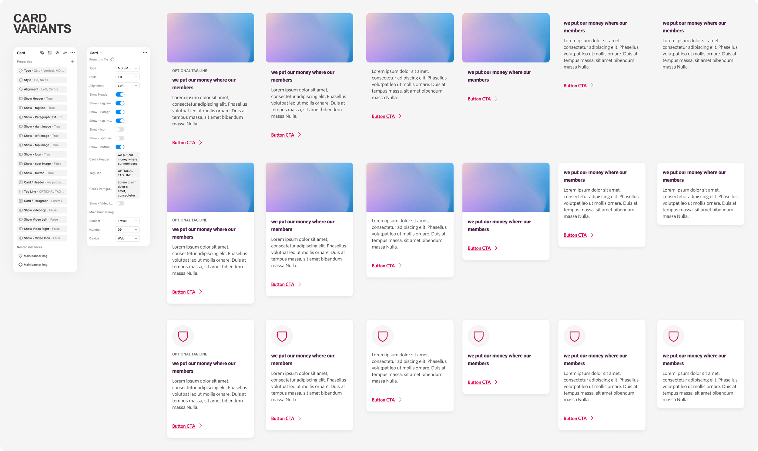
Leveraging atomic design principles, we built modular components, utilising Figma Properties, that could scale across templates. Every decision was grounded in accessibility, scalability, and collaboration—laying a strong foundation for future growth.
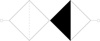
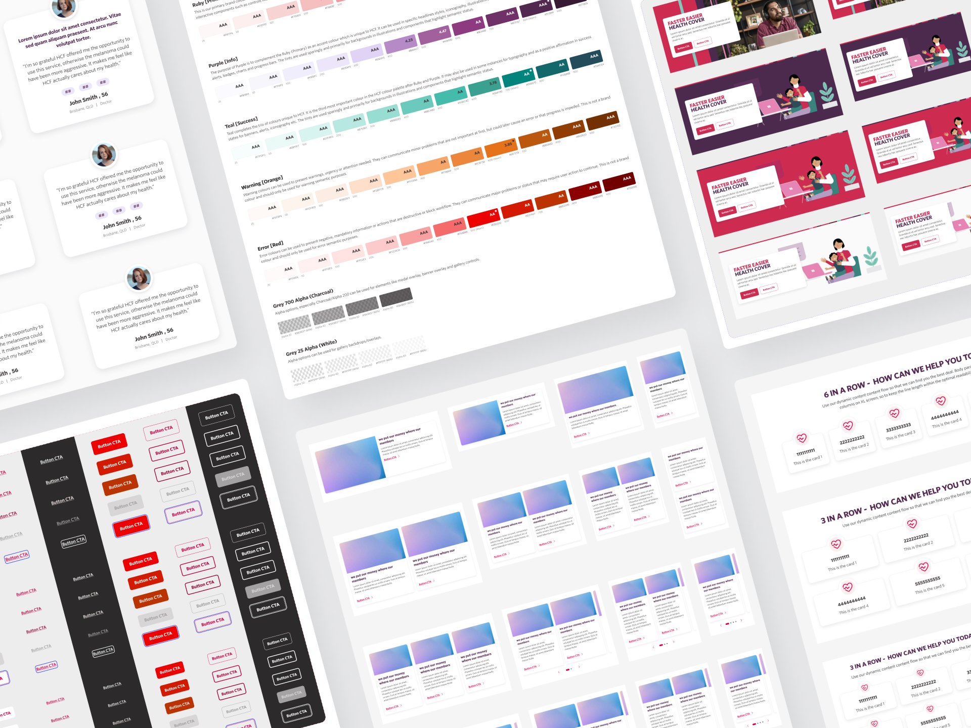
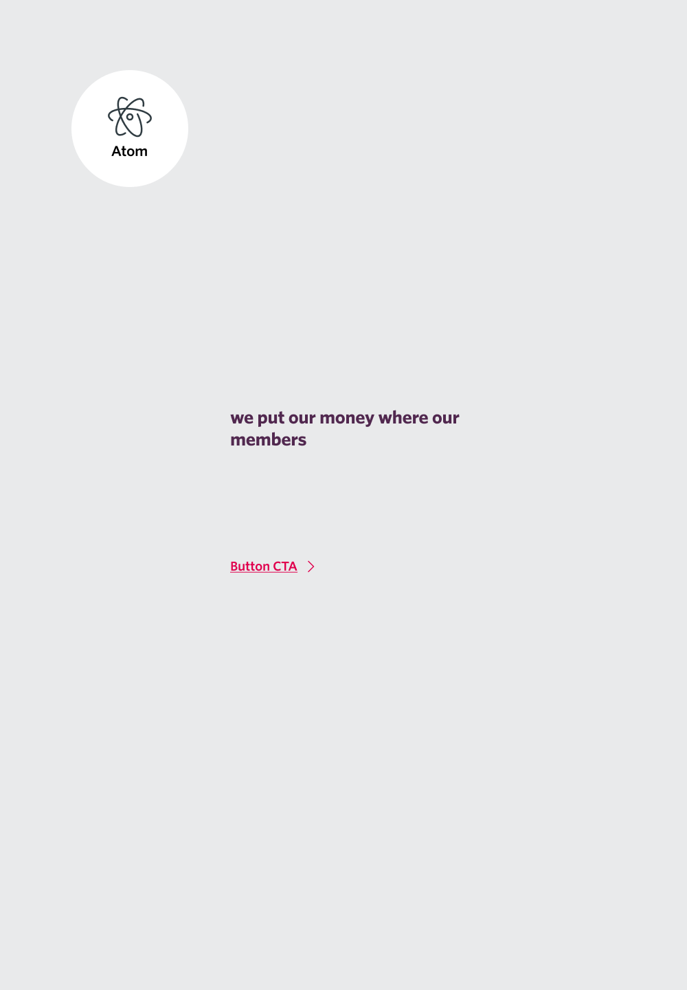
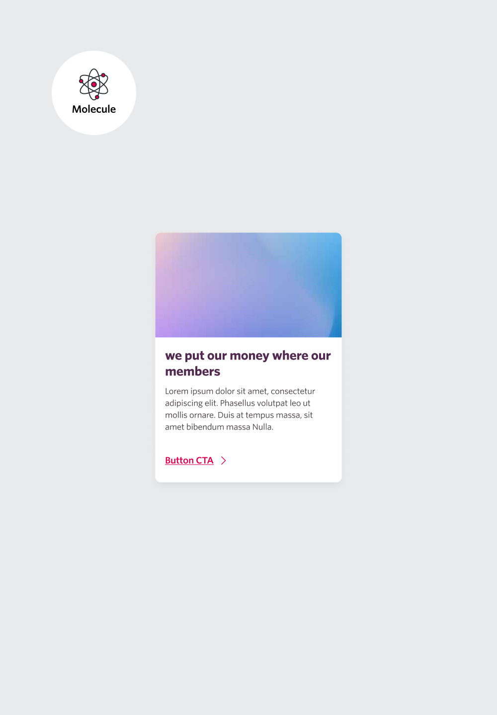
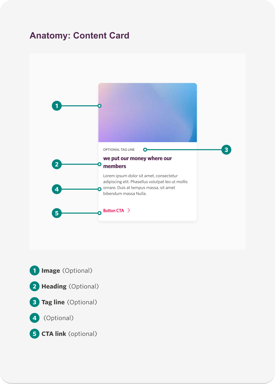
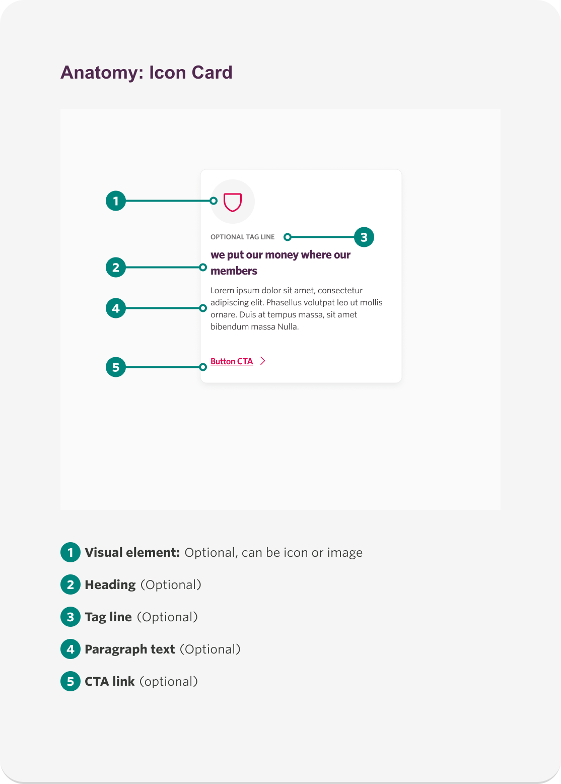
⚛️ Atomic Design in Action
We adopted Atomic Design, breaking the system into foundational elements, simple components (atoms), combined elements (molecules), and complex structures (organisms).
Foundation
Established a strong base by defining typography, color palettes, responsive grids, shadows, spacing, and iconography.
Atoms
Built fundamental components like buttons, badges, and form labels.
Molecules
Progressed to combined elements, including checkboxes, dropdowns, accordions, and callouts.
Organisms
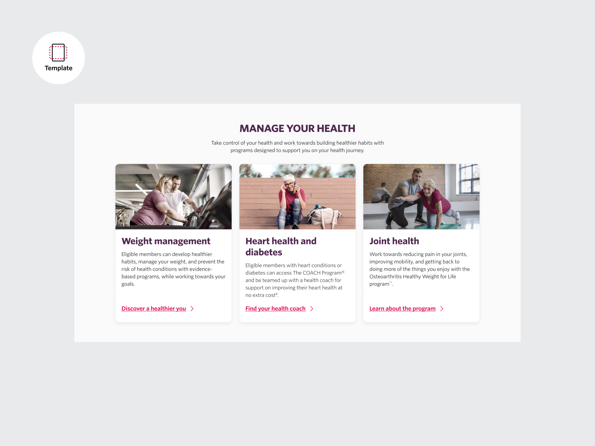
Developed complex UI elements, such as cards, promotional banners, panels, headers, and footers.
Furthermore, ensuring seamless implementation, we leveraged advanced Figma tools like auto-layout, tokenization, and strict spacing semantics.
♻️ Reusable Patterns
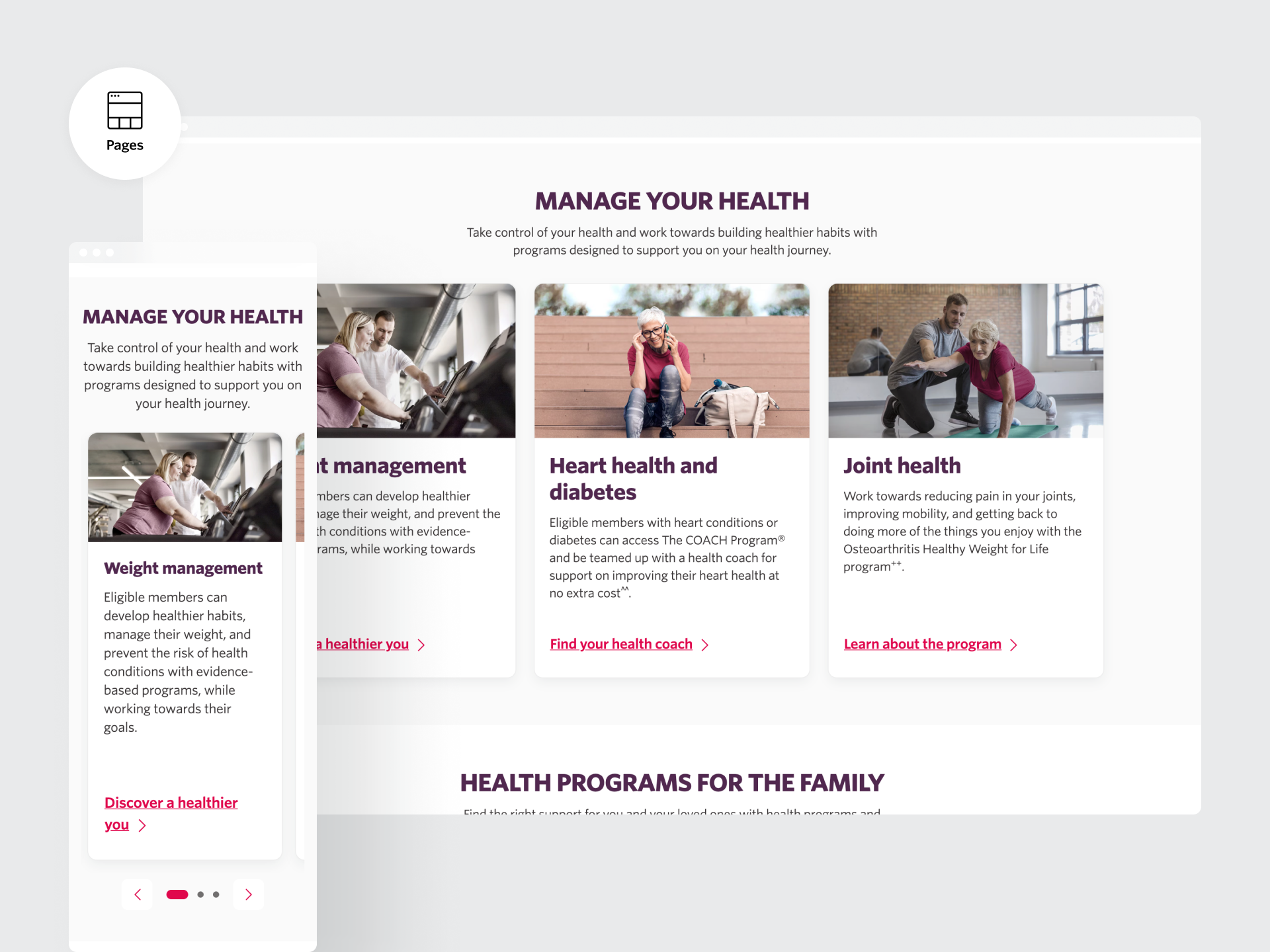
To ensure scalability and efficiency, each component was built with reusability at its core. We identified common UI patterns across the 12 foundational templates—such as forms, navigation, content blocks, and CTAs—and designed them as modular components within the system.
By aligning layout logic and interaction behaviors, these components could be confidently reused across different contexts without needing to be rebuilt or restyled. This approach reduced design and development effort, improved consistency, and laid the groundwork for faster scaling in future product phases.
🎨 Figma Systemisation
We leveraged Figma’s advanced features to create a flexible and maintainable design system. Components were built using component properties to allow for quick toggling of states, content variations, and instance swaps—without duplicating assets.
Prototyping was elevated with interactive variants, enabling realistic user flows that could be shared with stakeholders for fast feedback. We also implemented tokenisation through variables for spacing, colour, and typography, helping to align with future theming requirements and ensuring the design system remained accessible, responsive, and developer-friendly from the ground up.
An Agile Approach
The project was structured into two-week sprints, each focused on component creation, stakeholder collaboration, and regular showcases. Every component underwent meticulous review for pixel precision and compliance with WCAG AA accessibility standards before handoff.
Collaboration with key stakeholders—including Brand, Product Owners, and SMEs—was central to the process. Regular workshops and sprint reviews ensured continuous alignment and iterative progress throughout the project.
Documentation and Accessibility
Detailed documentation was created for each component, ensuring clarity for developers and other stakeholders, this included component usage, limitations, rules, and interaction guides. Accessibility standards were prioritised at every stage, with all components meeting at least WCAG AA requirements, and keyboard interactions also documented.
Delivery
The WHAT – Outcomes and Impact
WIN! We delivered 12 templates fast — a scalable, future-proof system that impressed leadership and marked a strong finish to Phase 1a.
The Result
We successfully built a future-facing design system from the ground up — one that not only modernised HCF’s dated and fragmented digital presence but also embedded accessibility, scalability, and brand consistency at its core.
The system replaced outdated visual patterns and inconsistent UI with a clean, modular framework designed for real-world flexibility. Components were crafted using atomic design principles, tokenisation, and Figma variables — enabling rapid iteration and adaptability across platforms.
Accessibility wasn’t an afterthought — it was built in from day one. Every component was rigorously reviewed to meet WCAG AA standards. From colour contrast and focus states to keyboard navigation, we ensured that inclusive design was woven into every interaction.
This new system didn’t just improve the user interface — it breathed life back into the HCF experience. The result was a sleek, unified digital presence that felt more trustworthy, intuitive, and modern. It empowered teams to move faster, design smarter, and build with confidence — laying the foundation for a more consistent and human-centred future.


Words of appreciation.
Lets hear it directly from the team and our stakeholders!
Check out some key testimonials.