Refreshing Local water utilities

Serving as a part of DPE in-house design studio, we were placed on a transformation project for NSW Government Water
My Role: UX, UI, Copywriter
Project Type: Copywriting, UX Research, UI, & development
Tools: Figma, Miro, Jira, Confluence, SQUIZ, Screaming Frog, More+
Before we start
Some context
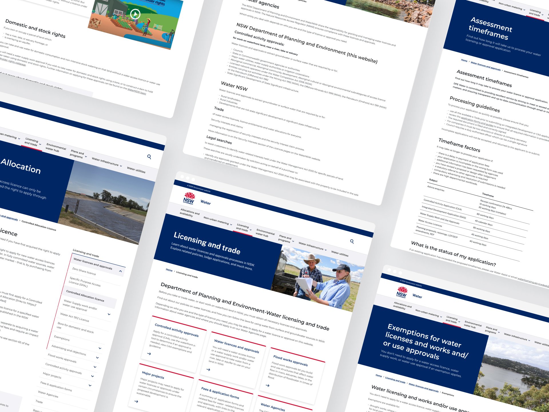
The Water NSW website felt like a relic—an outdated, maze-like experience that lacked any real consideration for the user. Its Information Architecture (IA), inherited from a previous vendor, resembled a chaotic patchwork more than a coherent navigation system, while the content read more like an academic journal than public-facing communication. The result? A high-stakes, high-friction experience.
Our mission was ambitious: transform the site into a user-centered, accessible, and cohesive platform—while managing a diverse group of stakeholders, including SMEs who saw the site as a storage facility for legacy content.
But this wasn’t just a redesign. It was about building trust, aligning conflicting priorities, and imposing structure on the chaos—all within a lean timeline of 12 weeks and a team of just two.
Discover
The WHY - Insights into the Problem Space
Water NSW sought to revamp their public-facing website, aiming to improve user experience, accessibility, and content clarity. However, the project had unique challenges:
-
Diverse stakeholders, including Subject Matter Experts (SMEs) and the communications team, presented conflicting priorities:
Some SMEs lacked knowledge of digital best practices, advocating for technical, journal-style articles that were inappropriate for web consumption.
Stakeholders prioritised their own sections of the website, often disregarding the overall user experience.
Last-minute requests for changes post-approval created inefficiencies in the workflow.
-
The initial project phases, handled by an external vendor, resulted in deliverables that lacked depth and usability:
The Information Architecture (IA) was high-level, with illogical content groupings based solely on page titles.
Minimal wireframes were delivered, leaving design and content decisions unclear.
Copy provided by the vendor was incomplete, lacked proper structure (no versioning or metadata), and required significant rework.
The transition to our in-house team during the final execution phase meant we had to revisit foundational elements while meeting tight deadlines.

Pre-discovery
Setting the Foundation
Before diving into user research, we conducted foundational activities to align on the project’s scope and vision:
Reverse Brief: We clarified project goals, ensuring alignment between the client’s objectives and our deliverables.
Stakeholder Mapping: We identified key stakeholders, including internal team members, council representatives, and website end-users, ensuring a holistic understanding of the audience.
Project Vision Definition: Our vision was to create a streamlined, accessible platform that reduced complexity and enhanced information accessibility for diverse users.
User Identification: We outlined primary user groups, including council officials seeking compliance information, internal staff managing content, and residents accessing water utility resources.
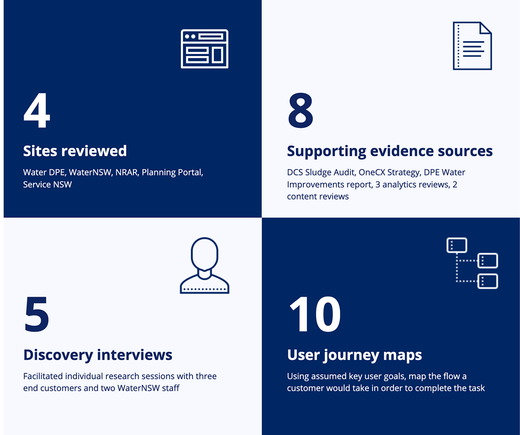
Desktop Research: Insights from Existing Resources
A thorough analysis of existing resources provided a baseline understanding of the site’s challenges:
Sludge Audit Findings: We reviewed recommendations from the Department of Customer Service’s sludge audit.
Original IA and Sitemap Mapping: The existing IA highlighted redundancies and a lack of logical structure.
Google Analytics: User flow mapping revealed high bounce rates on critical pages and inefficient navigation paths.
Website Walkthrough: Using the Hemingway Editor, we analysed content from 10 sample pages, identifying issues with readability, excessive jargon, and a lack of concise messaging.
UX/UI Audit: We reviewed visual design inconsistencies, excessive imagery, and components such as cards that contributed to cognitive overload.
Summary of research
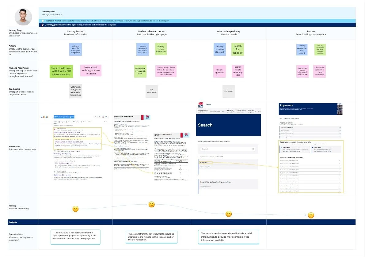
Sample customer journey map
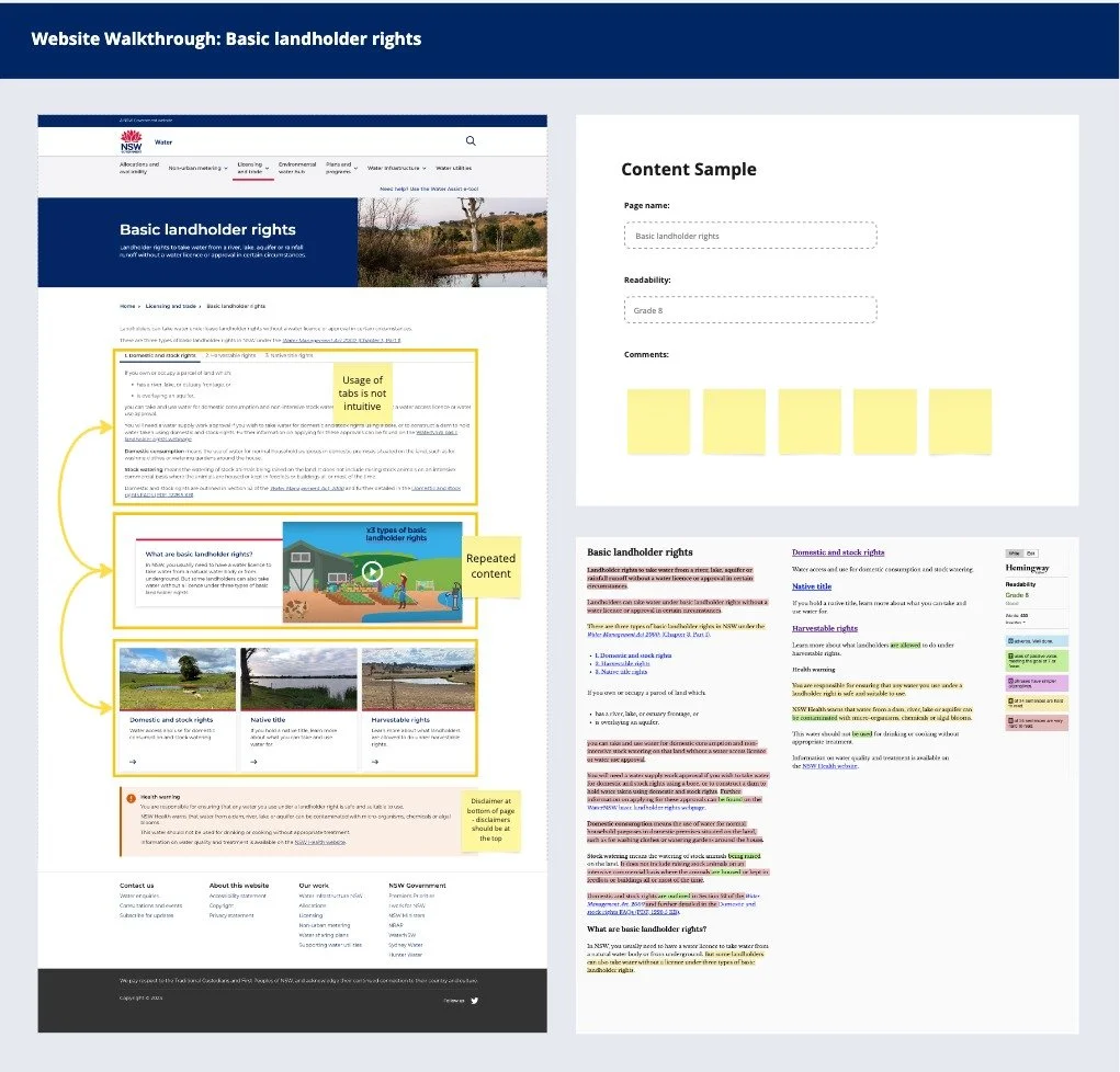
Sample readability review
Discovery
The discovery process marked the beginning of an in-depth exploration into user needs and challenges:
Website walkthrough: We conducted comprehensive website walkthroughs alongside internal stakeholders, synthesising key usability issues. The walkthroughs were immersive sessions that allowed us to experience the website as end users, uncovering hidden pain points.
Stakeholder Interviews: Scripts tailored for internal team members, decision-makers, and external users enabled us to collect qualitative insights. We booked interviews and established a cadence of weekly meetings to ensure constant alignment and communication.
Learning Goals Defined: A structured approach to identifying user pain points and desires informed our research priorities.
Page Categorisation: Each page was meticulously reviewed and classified into actionable categories: delete, merge, or edit. This exercise highlighted redundancies and helped focus efforts on impactful content improvements.
Persona Development: Drawing from interviews and research, personas were created to represent our key user groups. These personas provided a narrative, helping the team empathise with users’ motivations and challenges.
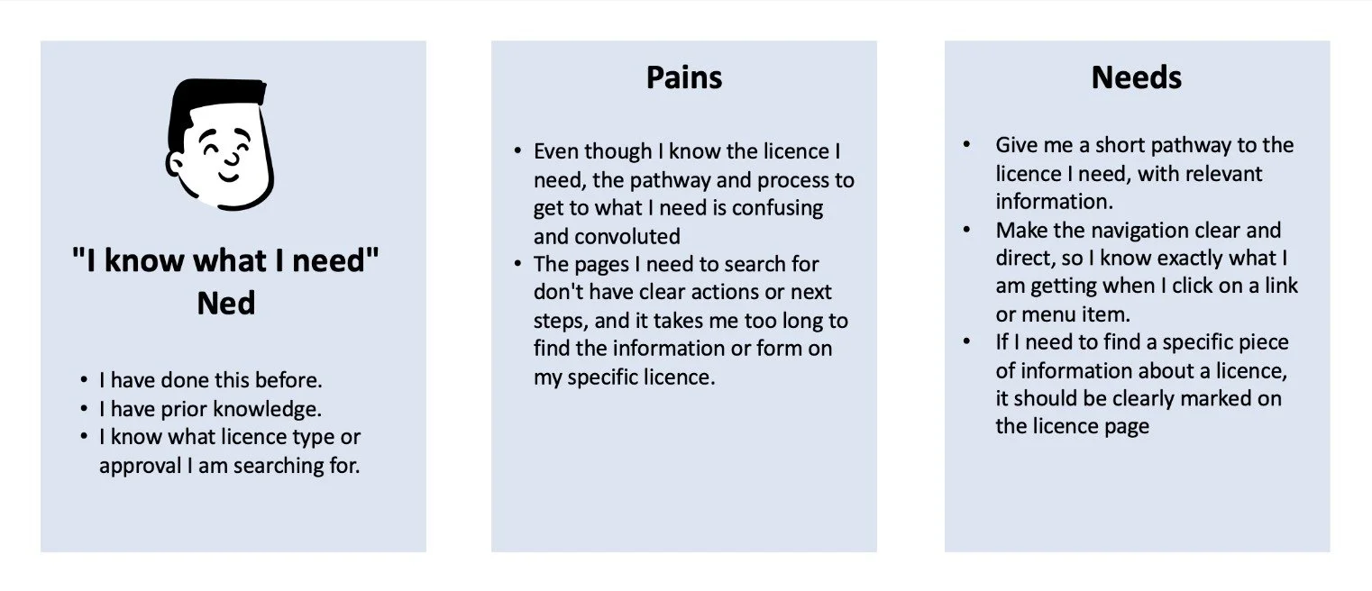
Persona 1: Know what I need Ned
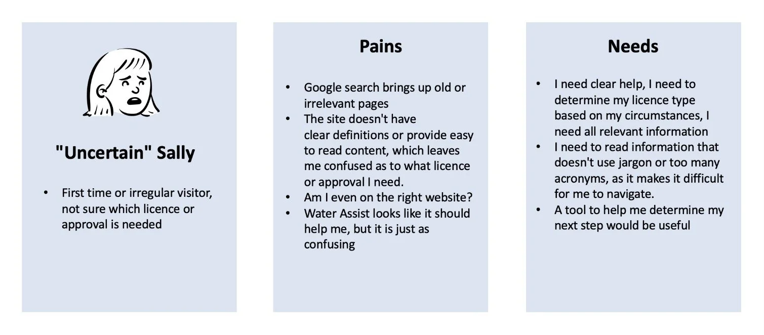
Persona 2: Uncertain Sally
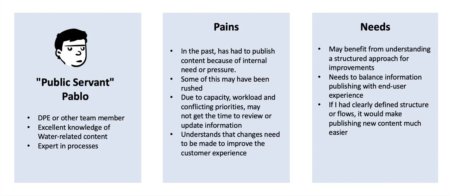
Persona 3: Public servant Pablo
Define
The WHY & HOW - Insights and Recommendations
Synthesising insights from discovery led to actionable recommendations. Here’s how we defined the path forward with content and page design principles:

Content Principles:
Removal of Redundant Content: Eliminated repetitive information to simplify user navigation, ensuring each piece of content served a clear purpose and value.
Content Reviewed by SMEs: Partnered with subject matter experts to validate accuracy and update content to ensure relevance and reliability.
Improved Readability: Simplified complex jargon into digestible language, using headings, bullet points, and formatting to enhance scannability.
Meta-Data Descriptions: Added concise meta-data for better SEO and user understanding.
Strategic Imagery Use: Reduced reliance on visuals, ensuring those used added functional or aesthetic value.
Page Design Principles:
Consistent Spacing: Standardized spacing across components, reducing whitespace at the page start to utilize screen real estate effectively.
Components Simplification: Minimized cards in favor of streamlined layouts and prioritized a clean, unified visual language.
IA improvement: Redesign shallower IA, reduce size of meg menu. Ensure priorities content is easily accessible, improve usability and reduce cognitive load.
We also set the stage for the next phase by crafting a cohesive framework for decision-making and refining user priorities.
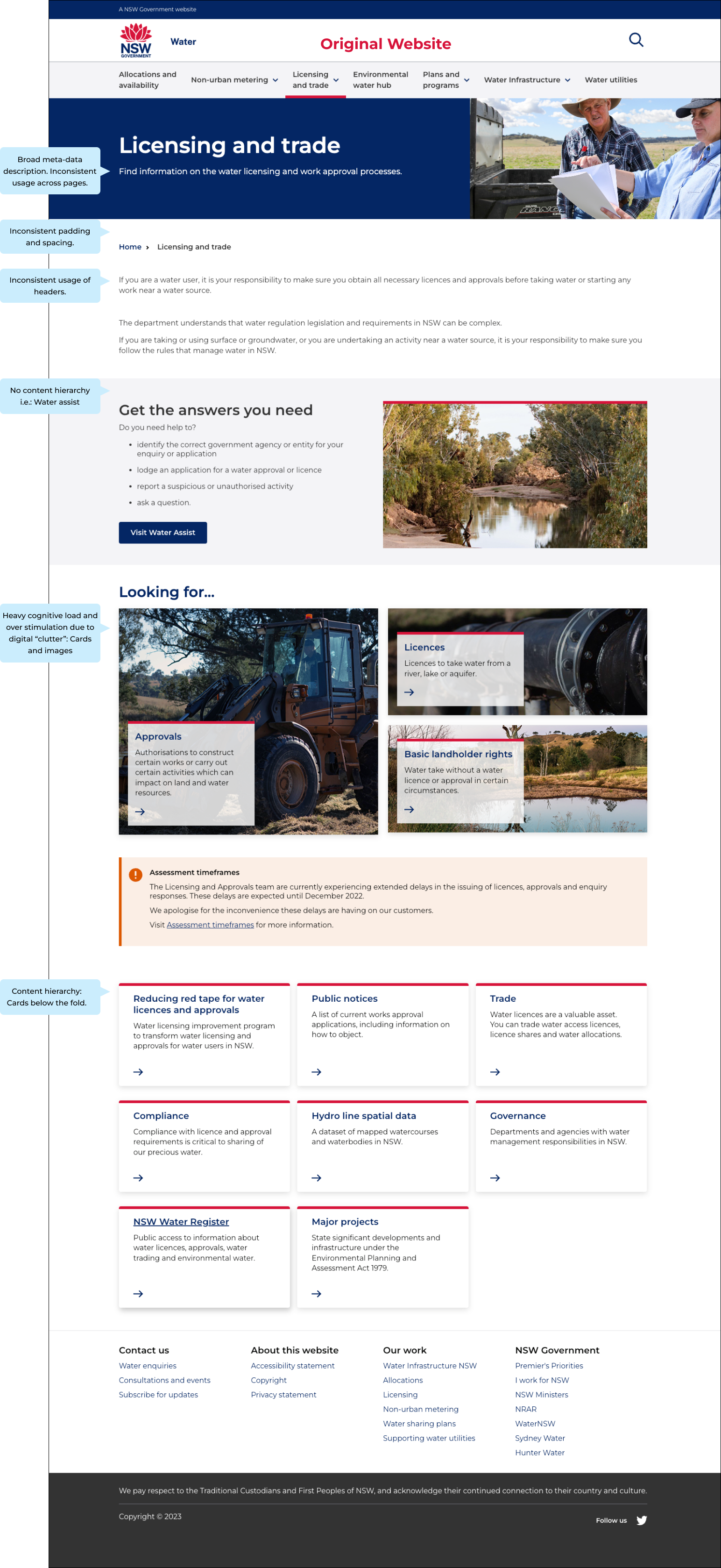
Original Home Page
Due to the scope of this transformation, only selected pages will be showcased. As highlighted through the home page, the website has a variety of experience issues - which led to the user feeling overwhelmed, and frustrated.
Develop
The HOW - Processes and Methods
The development stage saw us transitioning from insights to tangible solutions:
-
Built a content register, classifying pages for deletion, merging, or editing.
Implemented a version-controlled content review process:
Drafts were reviewed by SMEs, followed by iterative feedback loops.
Final approvals were facilitated by the communications team.
Structured content for consistency, readability, and accessibility.
-
Hybrid IA developed after thorough research and testing.
Transactional section split from policy
Overall shallower IA - reduced clicks
Unnecessary/outdated pages archived or modified
Mega menu condensed - certain lv1 items hidden from the dropdown, accessible through pages and right hand navigation
Simplified page layouts by:
Removing redundant components.
Revising content hierarchy for clarity.
Reducing imagery and visual clutter to lower cognitive load.
-
Developed wireframes and prototypes based on user feedback and client goals.
Iteratively refined designs to ensure they addressed pain points while aligning with brand guidelines and accessibility standards.
-
Scheduled weekly check-ins with the core team to maintain alignment.
Conducted regular usability tests to validate progress and gather additional insights.

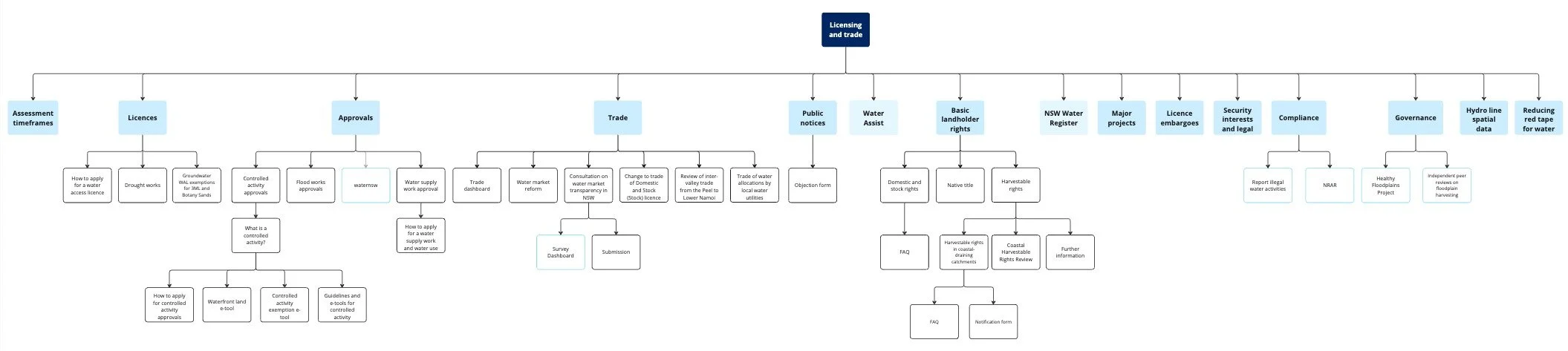
Original IA: Lacks hierarchy and logic
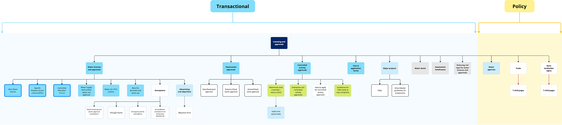
Revised IA: Improved usability and reduced depth
Delivery
The WHAT – Outcomes and Impact
With a solid foundation, the project culminated in delivering a transformed LWU website that balanced functionality, design, and content:
-
Implemented the updated IA, streamlining access to critical resources.
Archived redundant pages and established redirects for seamless user transitions.
Published the revised site live on Squiz, meeting all technical and functional requirements.
-
Achieved a clean, user-friendly layout that prioritized content over aesthetics.
Standardized navigation patterns to guide users intuitively.
-
Reduced redundant content by 40%, improving page load times and usability.
Enhanced readability with structured, concise copy across all pages.
Improved accessibility, achieving WCAG compliance.
-
Created a robust version-controlled process for ongoing updates:
Drafts were iteratively reviewed by SMEs and the communications team.
Final versions were archived for easy access and future revisions.
Empowered the client team to maintain and evolve the site independently.

The Result
By removing redundant journeys, components, and copy, the website was revitalised with improved accessibility, readability, and usability - validated by various forms of user testing.
Improved customer satisfaction scores observed through comparison usability testing and overall reduction of complaints. Information is easier to access and understand, observed through overall content reduction, improved readability scores, consistency across sites and a reduced number of simple enquiries in contact channels.
Key improvements:
25% increase in user engagement metrics (time on site and pages per session).
Positive feedback from internal and external stakeholders.
Improved readability scores (Hemingway)
Reduced cognitive load and clutter
Shallower IA, reduced click rate.
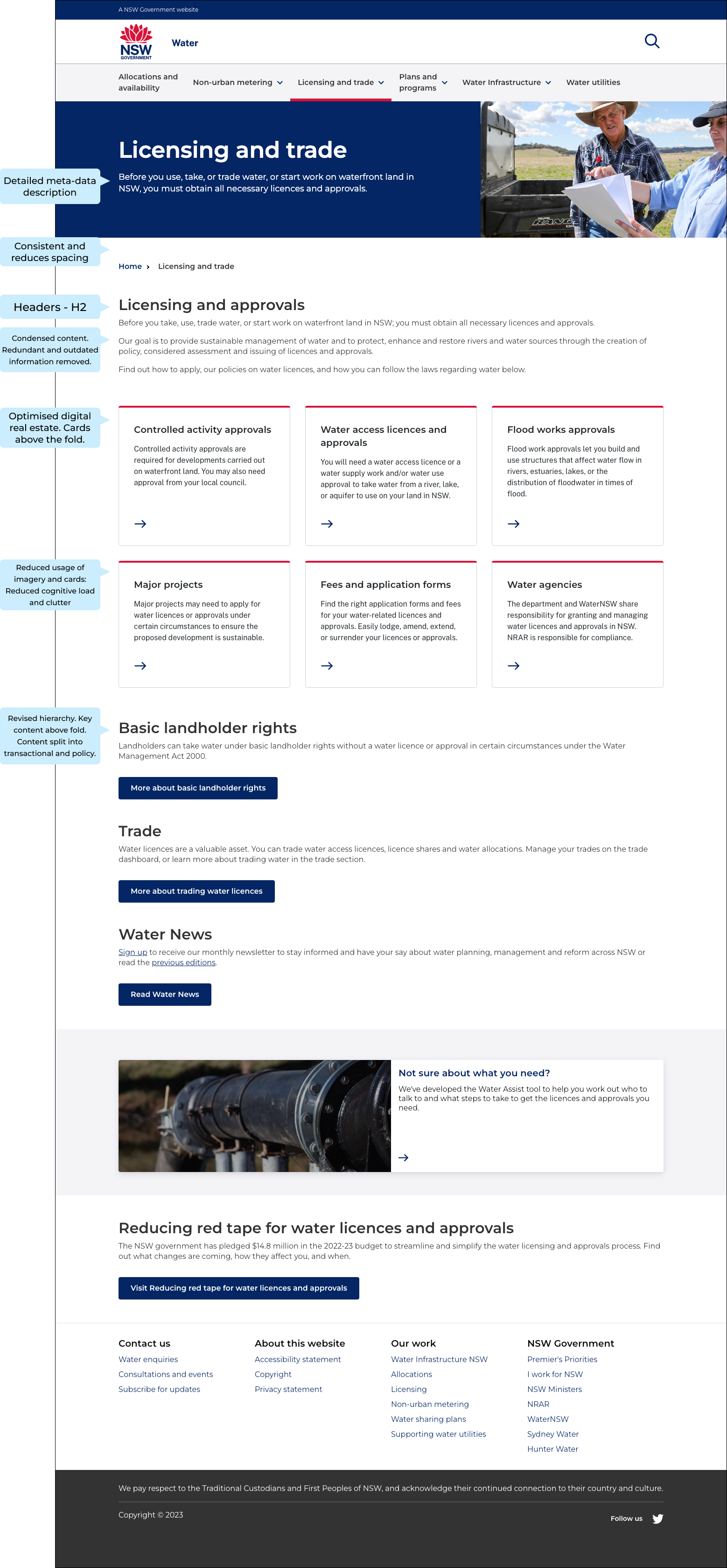
Revised Home Page
The home page was redesigned with the above defined content and design principals, leading to a reduced click rate, improved readability, and overall improvement in the user experience.
This result was prevalent across all the pages that were redesigned.
Words of appreciation
Lets hear it directly from the team and our stakeholders!
Check out some key testimonials.